Why dark surfaces make silicone look wrong (and how to fix It)
The colour is right. Against the light wall, the silicone disappears. Then it meets a black cooktop — and the same line suddenly glares.

It looks too light. It looks wrong. And it makes no sense, because you know the colour is exactly right.
It isn’t a mistake in the formula. It is an optical effect that kicks in the moment a sealant meets a surface darker than itself — and no darker tube from a catalogue will fix it.
The eye judges colour by its neighbours
We never see a colour on its own. We see it against what surrounds it. A narrow line between two large, dark surfaces is caught by simultaneous contrast: the darkness around it makes the line look lighter than it is.
It is one of the oldest results in colour science. Put the same mid-grey on black and on white, and the one on black looks lighter.
The colour hasn’t changed. The perception has.
So a silicone that is technically the same colour as the surface will always read lighter once it is pressed into a narrow bead between two dark planes. The darker the surface, the stronger the effect.
Why “just go darker” fails
The obvious fix is a darker silicone. It is a bit like turning up the volume on a song that is out of tune. Adding black pigment shifts the undertone. A warm dark grey turns cool. A rich brown turns muddy. The silicone stops belonging to the surface — it is just dark in a different way.
Because the problem was never the colour. It is depth. The surface absorbs light; the silicone reflects more of it. That difference is the line you see.
Formulating for depth
The answer is to give the silicone more optical depth — to make it absorb light in proportion to the surfaces around it. That means working on the translucency, the filler system and how the bead behaves at its edges, not only on the pigment.
Done properly, the silicone reads as shadow: the natural darkening you expect in a recess between two surfaces. It stops looking like a lighter material filling a gap, and the dark surfaces read as one.
Where it matters
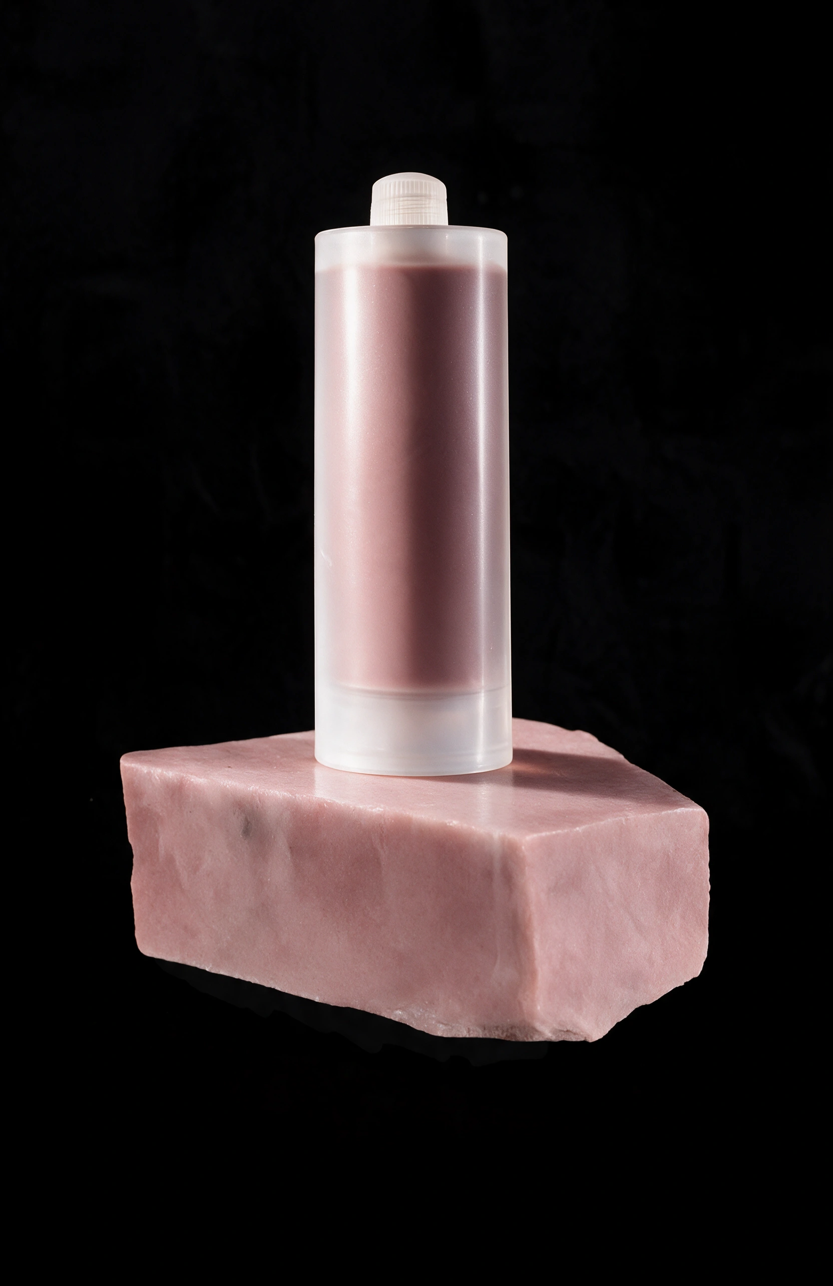
A worktop against a black cooktop. A light front next to a dark one. A splashback meeting a deep-toned counter. The standard tone is right for your colour — but next to something darker, the bead looks too light. That is what Shadow Tone is for: the same colour, formulated deeper, so the line sinks back instead of standing out.
Most people will never notice it. That is the point.
Don’t match the colour. Match the perception.